Let’s face it!
We judge things based on their beauty. People prefer to see pictures that can please their eyes and leave them in awe. Audiences want to go to websites that offer a user-friendly interface – free from clutter and distractions. We can’t help it, though. It’s pure psychology.
There are many factors to be considered when designing product packages and promotions, especially when it comes to website design. Aside from the button sizes, call-to-actions, pictures, the correct placing of columns and sections – there is one particular department which is often overlooked by designers – typography.
What’s the Importance of Typography?
Typography is the art and science of making words appear beautiful.
If pictures can speak a thousand words, then the reverse is also true. Words can paint pictures that can tickle the brain. Typography contributes to the overall marketability of products, and in this case, how websites can attract and retain traffic.
Web designing and SEO are not just about creating relevant and high-quality content. The game also lies in how words look. How they appear on different screens does matter.
Isn’t it cool when words match the pictures they describe? It’s oddly satisfying! Typography has the power to connect with the readers on a psychological level, far beyond the context of each group of letters.
In this article, we are going to talk about the best practices in typography that designers should remember when creating their website.
-
Consider Your Brand Aesthetic and Audience

Understanding your audience is very important when creating a website. Consider what your site’s purpose is. You don’t want to waste resources creating contents or designs which will not be appealing to your market.
The creative process largely relies on your target audiences’ preferences. What are the fonts that will make their eyes sparkle? Will it be appropriate for your products? Are they looking for something formal or geeky?
The goal of web design is to please the eyes of your market. Enter their brains, and you’ll be fine.
-
Learn About Kerning
Hold it right there. Typography is not all about fonts and attractive designs. It’s also about all the spaces in between – literally.
Kerning is about the right adjustment of spaces between letters based on the particular fonts style used. Character spacing should be proportioned to the font to achieve maximum aesthetic results.
Quite simple, right? So, don’t overlook this one. It’s going to have a significant impact.
-
Choose the Right Typeface
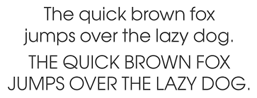
Some designers just don’t understand the distinction between typeface and font. Don’t be one of them. Be a pro and avoid being monotonous in your website text design. There’s a lot of choices when it comes to typeface: Calibri, Garamond, Times New Roman, Algerian, etc.
Font, on the other hand, is simply the variation of a particular typeface. It pertains to the size, thickness, italicization, and boldness of a given typeface.
Choosing the right typeface is important. Typeface conveys emotion, personality, and mood. You can provide a resounding visual language by pairing different typeface and fonts depending on the purpose of the text.
-
Take Note of Proper Alignment
What is it gonna be? Left, right, center, or justified? Proper alignment of text is a crucial part of website typography. It adds a lot of value to the readability of your copy.
Never settle for just a center alignment. Experts often turn their thumbs down with practice. Designers should be able to decide what’s best for their copy. The best way to start is to know the purpose and audience for a particular paragraph.
-
Consider Your Style on Mobile Platform

The mobile platform… of course! Your website’s mobile interface needs a lot of attention from designers, especially in the typography department. What works on the desktop might not work on mobile.
Typography is different when it comes to mobile. You have to make everything “bite-size.” The simpler, the better. But never stretch this principle too far. The best way to do it: consider the right scale on each device.
-
Make Good Use of Color Contrast
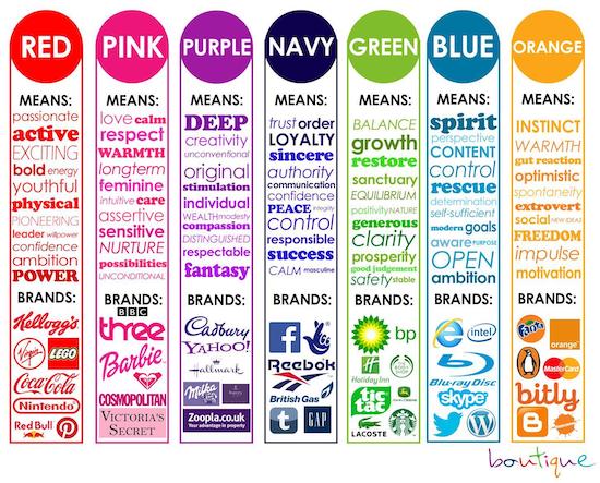
Visual art heavily relies on color. The same is true with web design typography. It’s not enough to focus on context, relevance, and font style. Designers should also make sure that the copy has an appealing color and contrast. This contributes to the overall user experience, which in turn, increase your SEO ranking.
You don’t want readers leaving your site just because they’re having a hard time seeing your copies, or worse, the text colors are too distractive. Designers should be able to apply a color contrast that helps the audience maximize their momentum when reading.
Typography is an indispensable part of website design. After all, people go to websites because they are looking for valuable information in the form of text, images, or video. Most of the time, websites present information through copies. It’s the main reason why 96% of web design relies on good typography.
Always remember that the purpose of typography is to entice the audience to keep reading. Help them read easily through your design. Make sure that the words in your website reverberate to their senses. Typography is an art, and you should treat it with respect.
Pictures are worth a thousand words. But when you can incorporate the beauty of pictures with words, you can offer something magical to your readers.
Author’s Bio:
Digital Drive (Web Design Belfast) is a web design company and certified Shopify Experts. They are focused on delivering creative website solutions to help ambitious companies grow online. They embrace new challenges with a desire to help their clients achieve success.