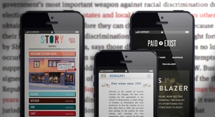
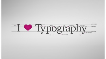
Quite similar to the web development community, even the mobile development professionals have been putting special emphasis on the use of good typography. It is believed that excellent typography introduces an amazing amount of ease in reading text on different mobile devices. If you too have been associated with mobile development and are concerned about using the right typography in your designs, then this is a post just for you.
Here, I’ll be making you familiar with some easy-to-follow tips on improving readability of websites when viewed on mobile gadgets with varying screen sizes and resolutions.

- Get the Measure right
Measure is basically the length of a line of text. In other words, it is the ideal length for a specific line of text. Typically, the measure for effortless reading is around 65 characteres. However, the physical length for the measure depends on the design of typeface, tracking as well as the exact text that’s being used. For a majority of mobile devices, a measure of 65 characters generally extends beyond the boundaries of browser. While it is a bit daunting to know that there’s no commonly accepted measure standard for measure on a mobile phone’s screen, all the narrow columns of text available in newspapers and magazines aim for 39 characters- a measure which works well for the mobile typography.
- Find the Sweet spot in your font
Every font has at least one sweet spot. The term ‘sweet spot’ refers to the point where a majority of strokes get lined up with pixel grid. Also, this is the same point where the anti-aliasing(applied in browser) distorted the design of typeface very minutely. The act of setting a specific font to its sweet spot leads to an increased level of contrast.
- Reduce the contrast between text and background

Since the human brain judges importance on the basis of context, it is recommended to reduce the contrast between text and background. The more is the size of the body text, the more is the quantity of text visible on the screen. Since a lesser amount of text is visible on the mobile devices, the contrast tends to get exaggerated. In case of mobile devices, you need to tighten up the ratios for reducing the contrast of type sizes.
- Don’t forget to tighten the leading
Leading refers to the space between lines. When set too tightly, leading makes the saccade jump from the end of one line to the beginning of the next. On the contrary, when set too losely, leading entails that the gaps between words start lining up, thereby creating something that’s referred to as ‘rivers’ which seem to interrupt the smooth flow of line. Here, it is interesting to know that the typical standad for leading is around 1.4em. This is too tight for screens. A key characteristic of typeface is a large counter which requires an extra leading in order to maintain a remarkable spacial hierarchy. On reversing this rule, we find that a shorter measure would require less leading.
Therefore, I recommend setting your leading looser for desktop styles and tighter for the mobile screens.
- Never lose the rag

Rag refers to the edge of a block of text. A major portion of what you read is already aligned towards the left side, thereby leading to a ragged right edge. Each time your eyes jump from one end of a line to another, your brain is able to judge the angle along with the distance of the next jump. This is possible only if all the jumps are consistent.
Hence, it is recommended to keep the left edge of your text as flat as possible, with each line initiating in the same place. Also, you should never opt for center aligning more than two or three lines of text. At times, you might have found that the text has been justified. That means, the words on the line are being spaced equally, thereby creating no rag on either side of the text. Not to forget, justified text leads to inconsistent whitespace. Also, in the worst cases, justified text leads to placement of a couple of words on a single line-something very jarring. Since a justified text is exacerbated by a shorter measure, it has greater chances of being unreadable on mobile devices.
- Make sure to adjust tracking
While adjusting the font sizes for mobile, it is essential for you to be aware about the changes that need to be done to tracking. Absolutely different from kerning, tracking refers to applying letter spacing to all the characters included within the font. You must remember that larger text requires less tracking while smaller text requires more tracking. So, if you’ve made some changes to the headings or are using a display typeface with a tigher tracking, loosening up the tracking is what you must do without giving any second thought.
That’s it!
Conclusion
Honing the craft of typography is something that has always kept the designers occupied. Since every typeface, text and technology introduces innovative typography challenges, following some simple rules can get you out of a tough situation. Here’s hoping the above post would help you in laying out text beautifully on the mobile devices.
Author Bio – Mike swan is professional WordPress developer and helps users in converting PSD to wordpress theme services. He loves to share his experiences in web design and web development trends.
