With such a nip and tuck competition, we are well aware of the fact web development has transcended several levels of complexity and aim to deliver top notch projects. Now as soon as any market trend comes in the market everyone hops on to embrace these trends.

Embracing the trends is certainly what we need to reflect that we are on the advanced level and have moved on to a new level. So the moot point is how to be advanced and yet stand out from the masses. To not just be another website among the plethora of others present out there you need to add a pinch of creativity so as to add zing to your development.
Recommended:
15 Creative Typography Art
Wonderful Examples Of Ornamental Typography
We are well aware of the fact that mobile web is quite in demand, and this is the reason why we need to make sure that the typographic style that we are using suits to all the browsers irrespective of the shape and orientation of the device that the user is using to browse the app.

Typographical Trends
In modern Web design, we can see the define the five typographical trends that are emerging out to capture the development trends.
- Extreme large and small size
- Very thick strokes
- Apply your creative ideas
- Artistic or Dramatic fonts
- Text superimposed on images
In this blog, we will find out the best techniques that can help you to incorporate the best typography in your website.

Extreme Size
The size of your typography has a very serious impact on the users who are browsing your website.
Large Typography
Large typefaces create a great impact on the users when they are combined with incredible images.
Very thick strokes
When it comes to trends, we can see that there is something or the other that keeps on changing the trends. I have even come across websites those expand the text on the entire screen of the website. At times, designers make use of serifs that are added to create a dynamic contrast in between the thick strokes. We also see on-screen words alternating in size.
This is quite a popular trend. Thus, you can make use of this to get some creative touches. You do not have to make sure of getting different alignments, for instance, the left or right, to avoid”centered” crutch.
Using this size will help you to deliver your message quite efficiently, so you do not require caps as you necessarily do not require them. Finally, you can make use of a customized color to give your website a personal touch or your brand and also unique identity.
Now we have another technique that you might find useful for designing huge fonts: you need to first get a very large font, and then you can go back to the size that is appropriate for your screen size. Choosing this approach of starting big and then moving backwards, might let you find that the size you are choosing is bigger as compared to what you might have chosen.
Creative Use of Simple Typefaces
If you are buccaneering fellow and would like to travel an extra mile must experiment with text and typographic styles so as to get some different results.

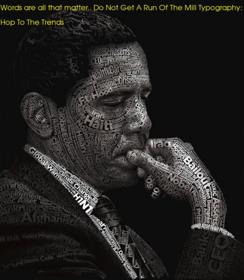
We have heard a lot about text superimposed on images but what if you insert images in your text.
Dramatic typography
Delivering an effective typographic experience is more that just effective readability and legibility not to avoid the fact that that these two factors are of course the primary focus.
No matter you use small or big, articulated or simple, web designers are efficiently using different typography styles to induce a dramatic look to your website. Dramatic typography has become one of the most adopted trends that help the web designer to come up with outstanding designs.
Wherein when we have a large number of words, choose a typography which is plain and not hackneyed one, this will help you to send the reader in a calm reading zone.
One can show more creativity by isolating sentences and even words that can penetrate deeper into the psychological grounds of the users as the text has now also treated visual design elements also.
Before moving further, we need to remember that dramatic typography and simple typography are not mutually exclusive. All in all simplified typography has come out to be one of the most popular forms when we consider the dramatic typography.
In short, dramatic typography is one of the best typography which is visually attractive no matter what reason it can be.
Font availability
The increased availability of typefaces is the major reason behind the popularity of typefaces. There are an ample lot of fonts available and that too at a very nominal rate or even at no cost on Google font.
The cherry on the cake is Adobe’s Creative Cloud plans, for instance, the Typekit service. Today, web designers have a plethora of options present for them and that tool at an affordable rate. This vast pool attracts the range of designers to try their hand at several new things.
Author Bio : Claudia is a certified Magento developer working at Magentax. She also enjoys writing tutorials and articles guiding users to hire Magento ecommerce developer and perform Magento development themselves.
